


Overview
Ubiquity Retirement & Savings is a leading retirement plan provider known for pioneered the 401(k) flat-fee model. They’re one one of the earliest companies in the industry, boasting over 25 years in business. While their time in the space had built a wealth of trust with existing customers, their brand (in need of a refresh) was proving to be problematic for winning new customers and standing out in a dynamic landscape of emerging competitors.
Recognizing their need to modernize, Ubiquity engaged Dreamten to help them craft a new brand and overhaul their website. We kicked off the project with our strategize workshop where we worked with the team to develop their vision, define objectives, and understand the company’s unique value prop. After working closely with them for several months, we launched a new and improved myubiquity.com.
TIMELINE
January 2024 - April 2024
Process
Strategize, Visualize, Systematize
Services
Branding, UX/UI Design, Web Design, Front End Development, Webflow Development
LINKS
Results
17
%
Increase in Qualified Leads
Immediately after the launch of the new website, the number of qualified leads jumped significantly, while the amount of spam requests reduced.
120
%
Increase in Organic Traffic
Because of the refreshed user experience and SEO/performance benefits of Webflow, organic traffic improved dramatically right after launch.
99
Ahrefs SEO Score
The new site has a near perfect Ahrefs score, meaning all of Ubiquity's website content will rank higher and be easier to find in search engines.
“Dreamten's active listening and involvement really helped keep things on pace and take the work to the next level. There was nothing Dreamten could have improved on. It was such a positive experience that we want to work with them again.”
Melissa Cherry
VP of Demand Generation, Ubiquity

The homepage
One of our objectives with the homepage hero was to establish an instant, personal connection with the target audience—business owners in need of a retirement plan for their company. The hero contains a carousel featuring different types of business owners along with key plan features best suited for that persona.
Within a few seconds, business owners can see themselves in the imagery and grasp Ubiquity’s value of highly custom retirement plans.


Product pages
Ubiquity’s retirement plans are designed with 2 types of businesses in mind: businesses with employees, and businesses without them (freelancers, sole proprietors, etc.). We designed a product page for each type of business with content and imagery specific to the differing needs. which functions as a jumping-off point to get a specific 401(k) plan recommendation


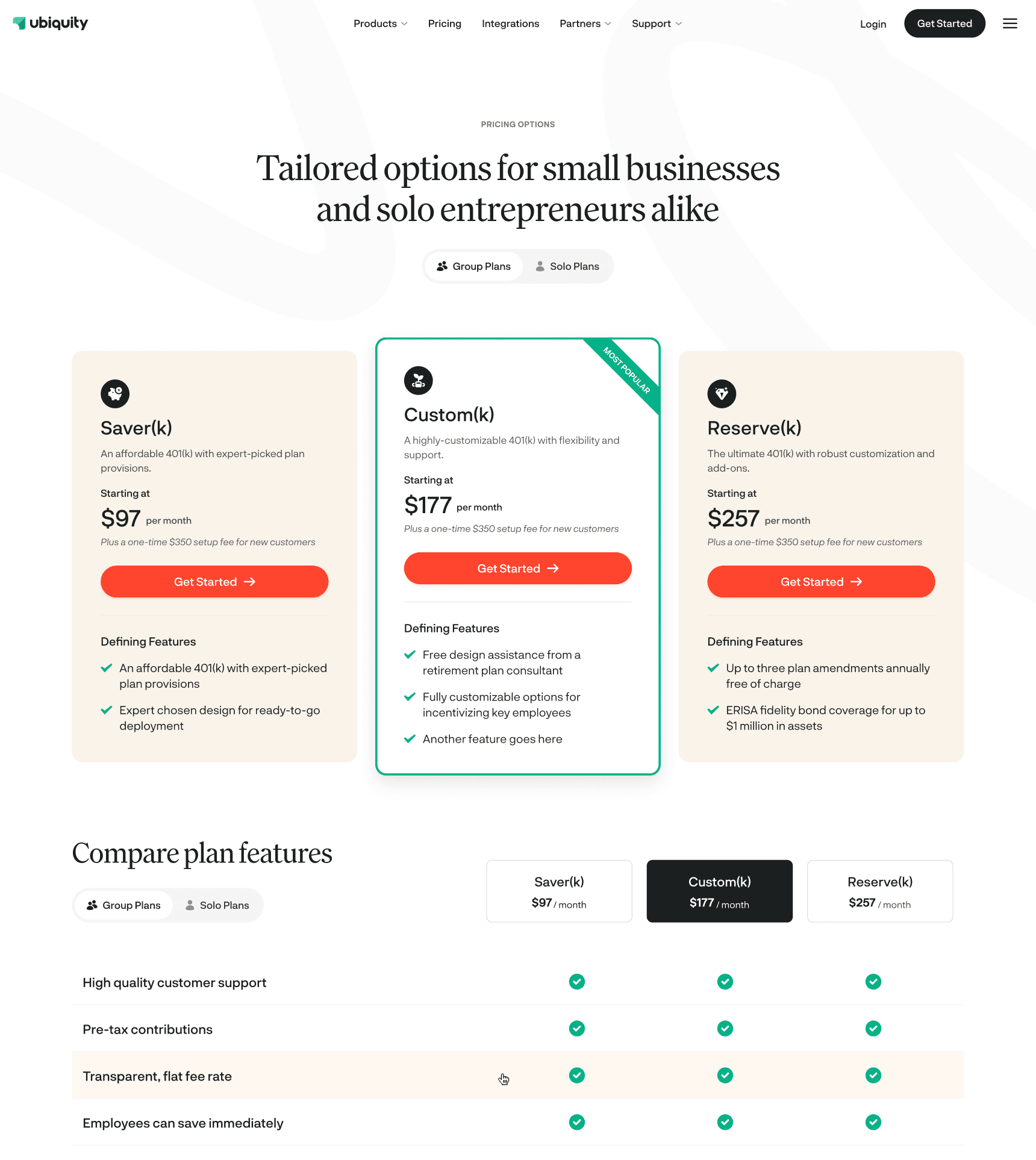
The design system & elements
A design system of standardized and repeatable elements was created to empower Ubiquity's marketing team to build new pages of the website quickly with consistency.


The new logo
After several rounds of logo iterations, the Ubiquity team selected a symbol embodying traits of an upward arrow infused with leaf-inspired elements. Because they gravitated toward simplicity and abstraction, we did our best to ensure that the logo didn’t look too literal.


Brand elements
In our strategize workshop, the Ubiquity team used words like “expert”, “friendly” and “partnership” to describe their desired brand personality. While developing their brand, we let those terms guide us. The fonts, colors, styles and images were intentionally chosen to convey professional without being stiff, friendly without being too casual, and expertise without being pretentious.

